---
layout: presentation
title: Understanding Quantitative Data
description: Description of how to analyze study data and draw conclusions
class: middle, center, inverse
---
name: inverse
layout: true
class: center, middle, inverse
---
# Analyzing Quantitative Data
Jennifer Mankoff
CSE 340 Winter 2020
---
layout:false
[//]: # (Outline Slide)
.title[Today's goals]
.body[
- Discuss how we determine causality
- Practice onboarding participants
- Practice data analysis
]
---
# How do we determine *causality*?
Implies *dependence* between variables
Assumes you have measured the right variables!
---
# Dependence/independence
Events that are independent
- Flipping heads and then tails
- Day of week and whether a patient had a heart attack (probably?)
Events that are dependent
- Vice presidential candidate and presidential nominee
- Diagnostic test being positive and whether patient has a disease
???
What if we collect this kind of data, what might be true about it?
---
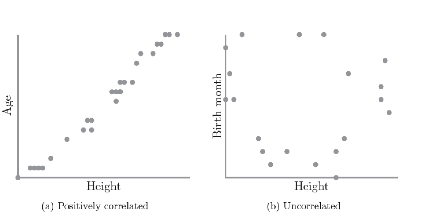
# What might we expect to see is true of dependent variables?
- When one changes, the other changes at the same rate
- When one changes, the other changes at a faster rate
- When one changes, the other does the opposite
???
Called a correlation
We can see it in a scatter plot
Go look at data and make one
---
# This is called *Correlation*
We can see it in a *scatterplot*
---
# Correlation demo
[OpenSecrets.org data set on internet privacy resolution](https://www.opensecrets.org/featured-datasets/5)
Open it yourself:
[tinyurl.com/cse340-ipdata](https://tinyurl.com/cse340-ipdata)
--

---
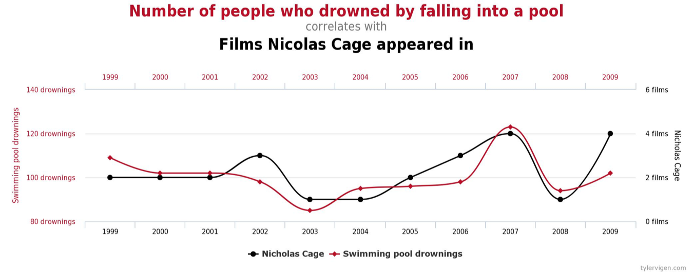
# Correlation != Causation
---
# Correlation != Causation

---
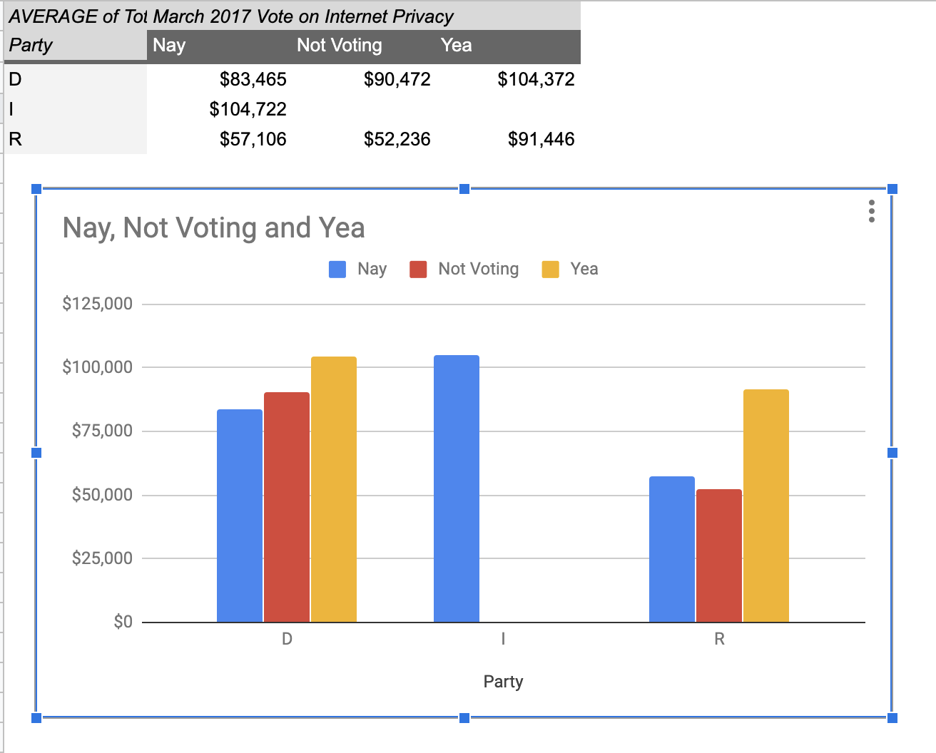
# Grouping for analysis
Pivot Tablest demo
[tinyurl.com/cse340-ipdata](https://tinyurl.com/cse340-ipdata)
--
---
# Grouping and charting helps you check your assumptions
speed: 
--
[tinyurl.com/cse340-20w-data](https://tinyurl.com/cse340-20w-data)
Not that different in my sample set (just me doing it 3 times). We
hope to see better results in your data, and even better if we merge
all your data!
---
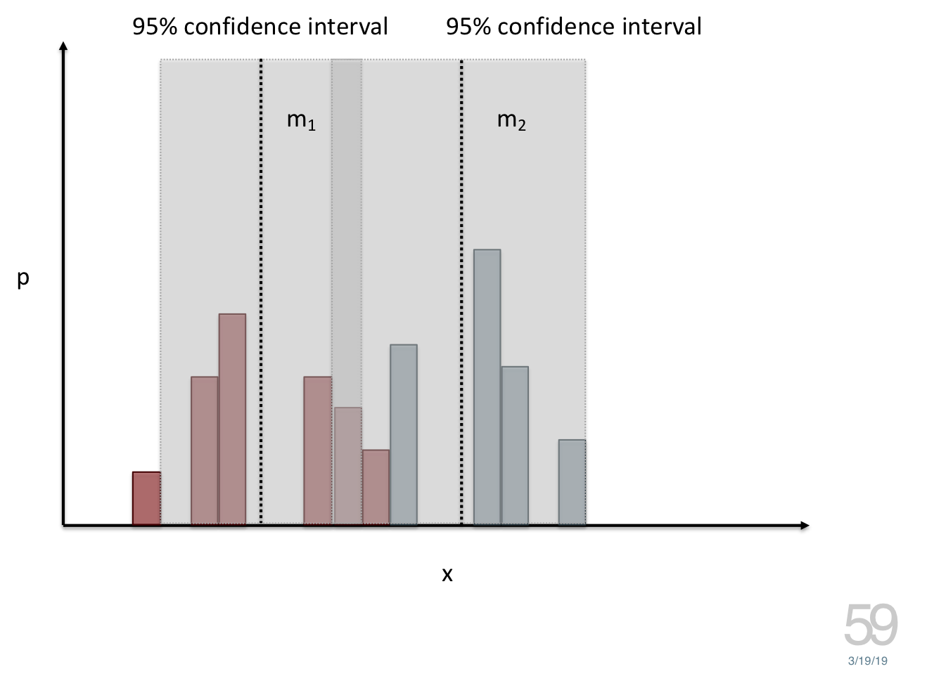
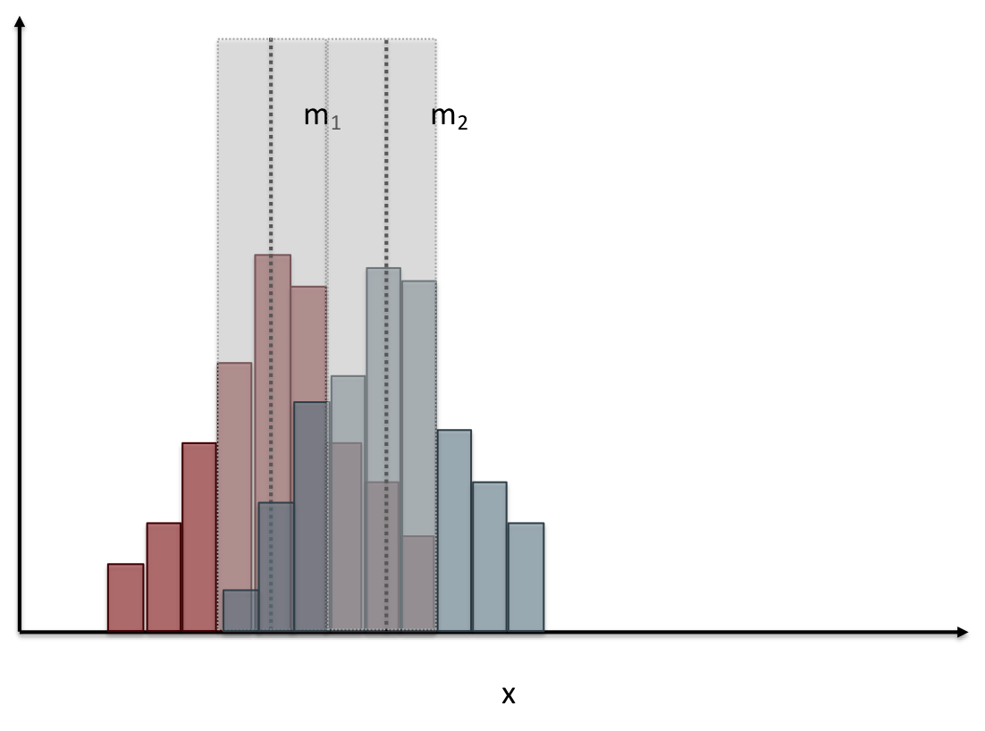
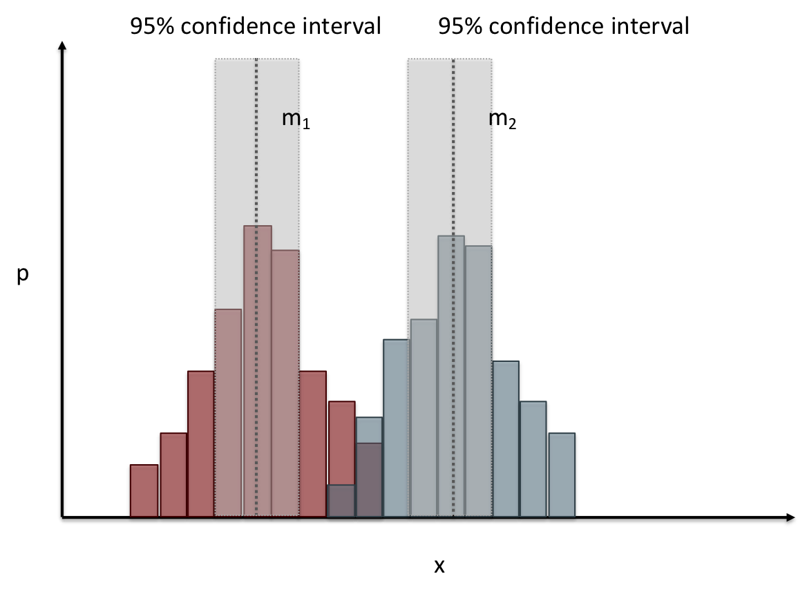
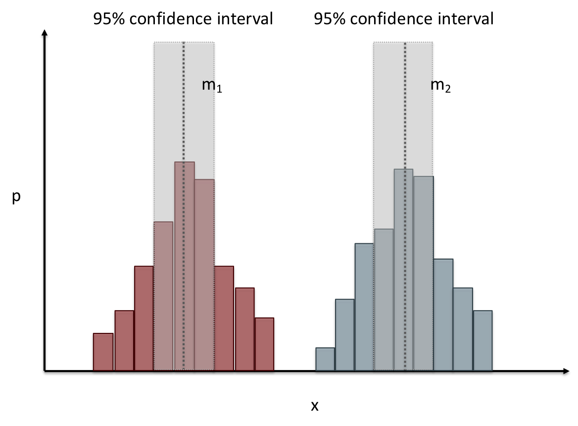
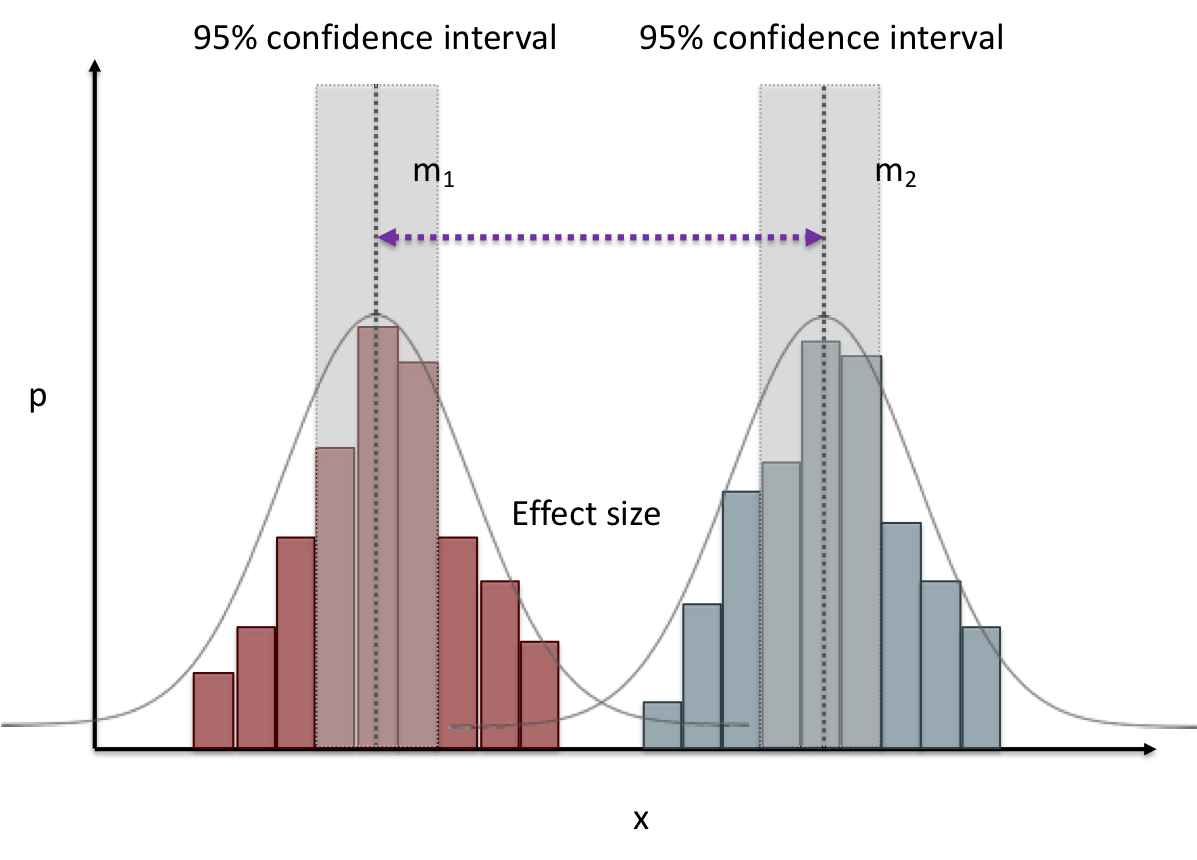
# Comparing two groups to see if they are different
Bar charts are not enough to assess difference though. Need to see the *distribution*
---
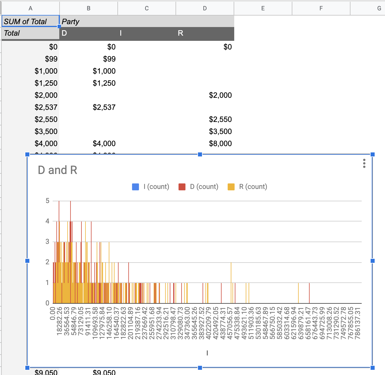
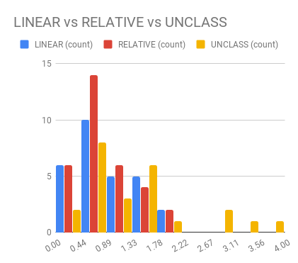
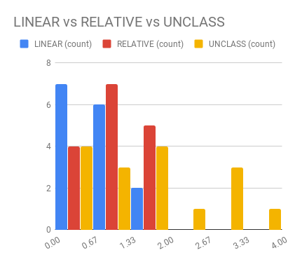
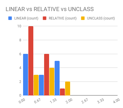
# Histogram shows you a *distribution*
Pivot Tablest demo
[tinyurl.com/cse340-ipdata](https://tinyurl.com/cse340-ipdata)
--
---
# But having the right chart matters
---
# Normal Vs Pie
|Normal | Pie|
|--|--|
|||
The cause of the difference only shows here.
---
# What do we learn from a histogram?
???
- shows a distribution
- helps us tell if things are INDEPENDENT
---
# Histograms
What do we learn from a histogram?
- shows a distribution
- helps us tell if things are INDEPENDENT
---
# Comparing two groups
---
# Comparing two groups

---
# Comparing two groups
---
# Comparing two groups
---
# Comparing two groups
---
# Comparing two groups
---
# Common Statistical Test for comparison: t-test
Tests for difference between two samples
Best used to determine what is ‘worthy of a second look’
Limited in its applicability to normal, independent data
Does not help to document effect size [the actual difference between groups], just effect likelihood
---
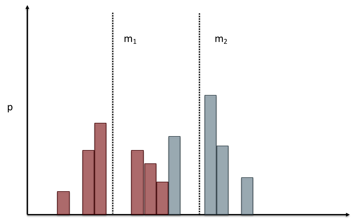
.left-column[
## Problems with t-tests
The more implausible the hypothesis, the greater chance that it is a
‘false alarm’
]
.right-column[

]
???
Top row: Prior (what's known to be true before the experiment)
bottom row: Calculated p-value
Notice the middle column, where something that is a toss-up has higher
plausability than we would expect. This is a "Type 1 error"
Alternatively, a small sample may cause a Type II error (failure to
detect a true difference) due to random sampling bias
---
.left-column[
## Problems with t-tests
]
.right-column[
- Doesn’t take prior knowledge into account
- Susceptible to ‘data dredging’
- The more tests you conduct the more likely you will find a result
even if one is not there
- Adjustments mid experiment
- Gives a yes or no answer: Either the null hypothesis is rejected (the result would be unlikely in a world where the null hypothesis was true) or it cannot be rejected
- Based on assumed ‘average’ sample
]
---
# Which problems might affect our study?
???
Too many comparisons
--
18 separate comparisons (3x3 conditions, 2 measures)
ANOVA (**An**alysis **O**f **Va**riance): Fancy t-test that accounts for the whole group effect before
doing pairwise comparisons
???
- Doesn’t take prior knowledge into account
- Susceptible to ‘data dredging’
- The more tests you conduct the more likely you will find a result
even if one is not there
- Adjustments mid experiment
- Gives a yes or no answer: Either the null hypothesis is rejected (the result would be unlikely in a world where the null hypothesis was true) or it cannot be rejected
- Based on assumed ‘average’ sample
---
# Demo of t-tests in our spreadsheet
[tinyurl.com/cse340-20w-data](https://tinyurl.com/cse340-20w-data)
---
.left-column[
## Document what all of this in your [report]({{site.baseurl}}/assignments/menu-report)
]
.right-column[
- Describe your hypothesis
- Illustrate with graphs
- Optional: use Table of results found in `Speed Analysis` and `Error Analysis` to describe Statistical Significance:
`Pie menus were twice as fast as normal menus (M=.48s vs M=.83s), F(1,43)=295.891, p<.05. Unclassified menu items were harder to find than linear and relative ones (M=.84s, .59s, and .59s respectively), F(2,43)=93.778, p<0.5. We also found an interaction effect between menu and task (as illustrated in the chart above), F(5, 43) = 51.945, p<.001.`
]
---
# Drawing Conclusions
.left-column[
<div class="mermaid" style="font-size:.5em">
graph TD
S(.) --> Hypothesis(Hypothesis:<br>Decreased seek <br>time and errors)
Hypothesis -- "Study Design" --> Method(3 menus x <br> 3 task conditions )
Method -- "Run Study" --> Data(Data)
Data -- "Clean and Prep" --> Analysis(Analysis)
Analysis --> Conclusions(Conclusions)
classDef finish outline-style:double,fill:#d1e0e0,stroke:#333,stroke-width:2px,font-size:.7em,height:2.5em;
classDef normal fill:#e6f3ff,stroke:#333,stroke-width:2px,font-size:.7em,height:2.5em;
classDef normalbig fill:#e6f3ff,stroke:#333,stroke-width:2px,font-size:.7em,height:4em;
classDef start fill:#d1e0e0,stroke:#333,stroke-width:4px,font-size:.7em,height:5em;
classDef startsmall fill:#d1e0e0,stroke:#333,stroke-width:4px,font-size:.7em,height:2.5em;
classDef invisible fill:#FFFFFF,stroke:#FFFFFF,color:#FFFFFF
linkStyle 0 stroke-width:3px;
linkStyle 1 stroke-width:3px;
linkStyle 2 stroke-width:3px;
linkStyle 3 stroke-width:3px;
linkStyle 4 stroke-width:3px;
class S invisible
class Hypothesis start
class Conclusions startsmall
class Method normalbig
class Data,Analysis normal
</div>
]
.right-column[
- Describe your hypothesis
- Illustrate with graphs
- Optional: Statistical Significance
Draw Conclusions
- Were errors less?
- Was time faster?
`Describe your conclusions. Do you think we should use pie menus more? What can we conclude from your data?`
]
---
# Limitations of Laboratory Studies
???
Simulate real world environments
- Location and equipment may be unfamiliar to participant [Coyne & Nielsen 2001]
- Observation may effect performance - “Hawthorne Effect” [Mayo 1933]
- Participant may become fatigued and not take necessary rest - “Demand Effect” [Orne 1962]
- Tasks frequently artificial and repetitive, which may bore participants and negatively effect performance
Studying real world use removes these limitations
--
Simulate real world environments
- Location and equipment may be unfamiliar to participant [Coyne & Nielsen 2001]
- Observation may effect performance - “Hawthorne Effect” [Mayo 1933]
- Participant may become fatigued and not take necessary rest - “Demand Effect” [Orne 1962]
- Tasks frequently artificial and repetitive, which may bore participants and negatively effect performance
Studying real world use removes these limitations